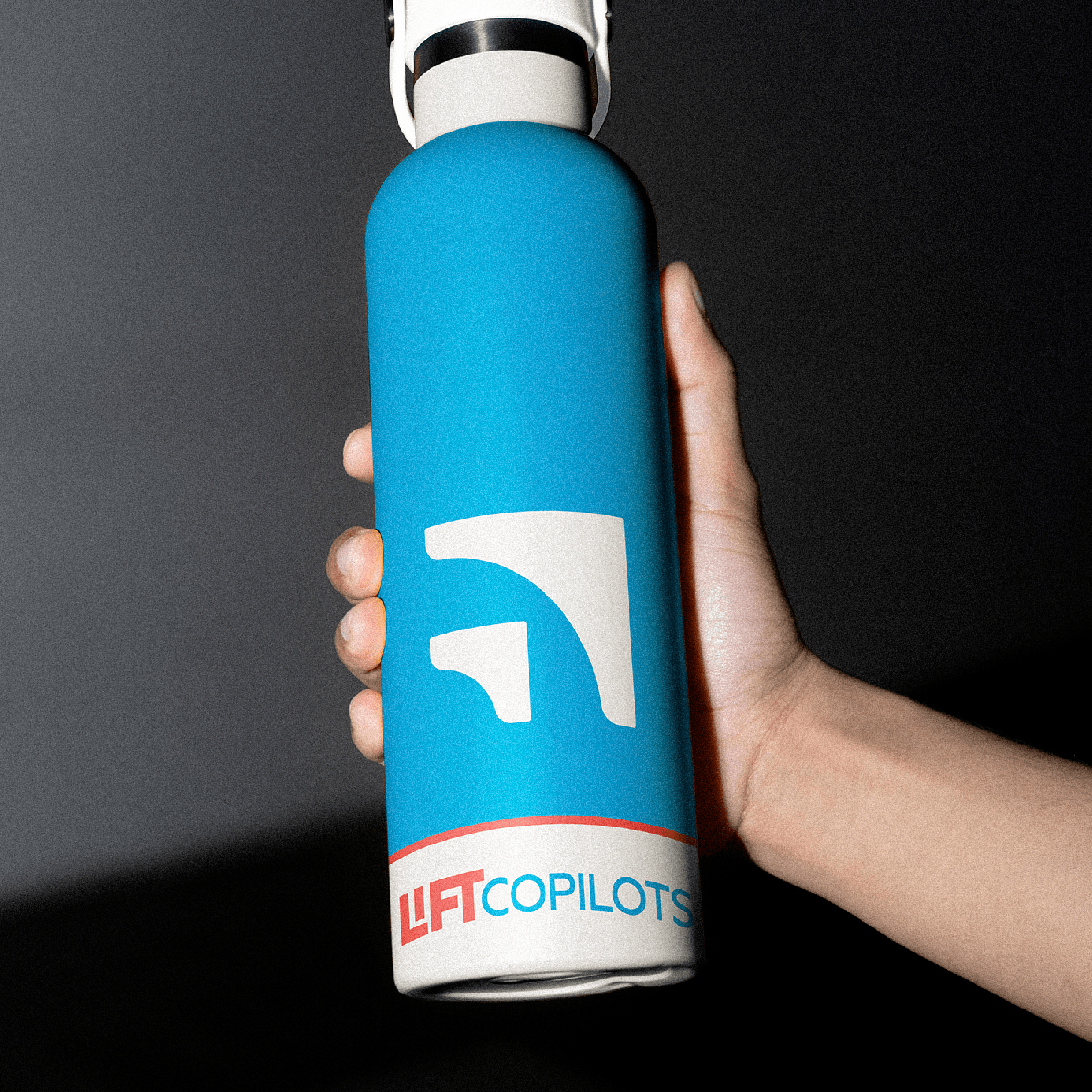

LIFT COPILOTS
WHO: LIFT Copilots positions itself as a fundamentally different kind of business consultant—one built on authentic lived experience rather than academic theory. The brand strategy centers on empathy through experience, emphasizing that LIFT Copilots founders have walked the same challenging path as their clients.
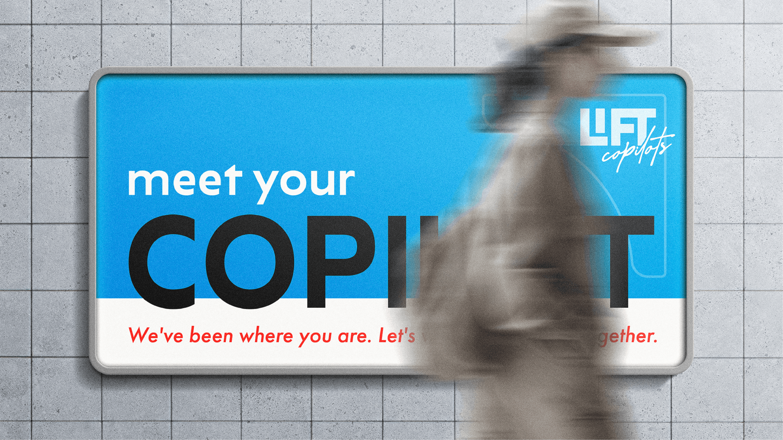
THE GOAL: The brand should feel like working with a knowledgeable friend who’s been in your shoes, not a corporate consulting firm. This positioning directly addresses a critical gap in the market: small business owners need guidance from people who truly understand their day-to-day struggles, not theoretical frameworks from consultants who’ve never run a business.
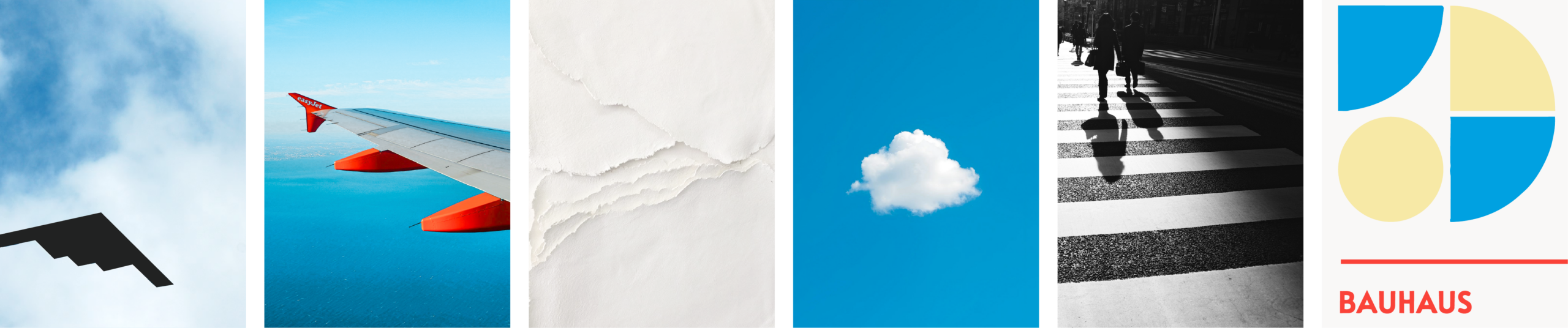
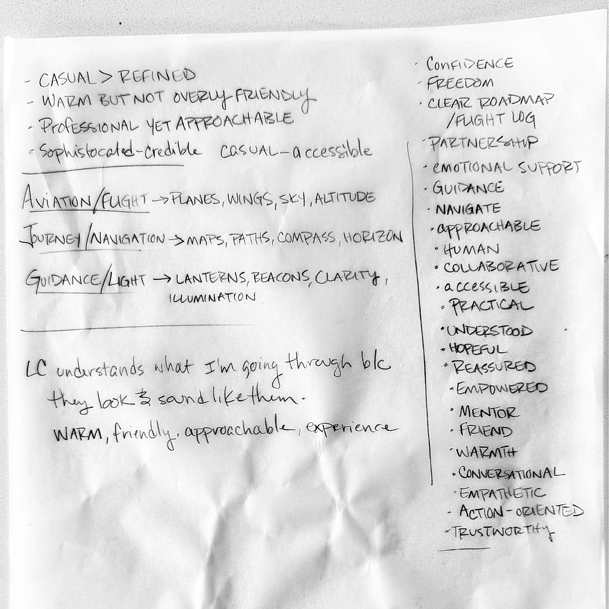
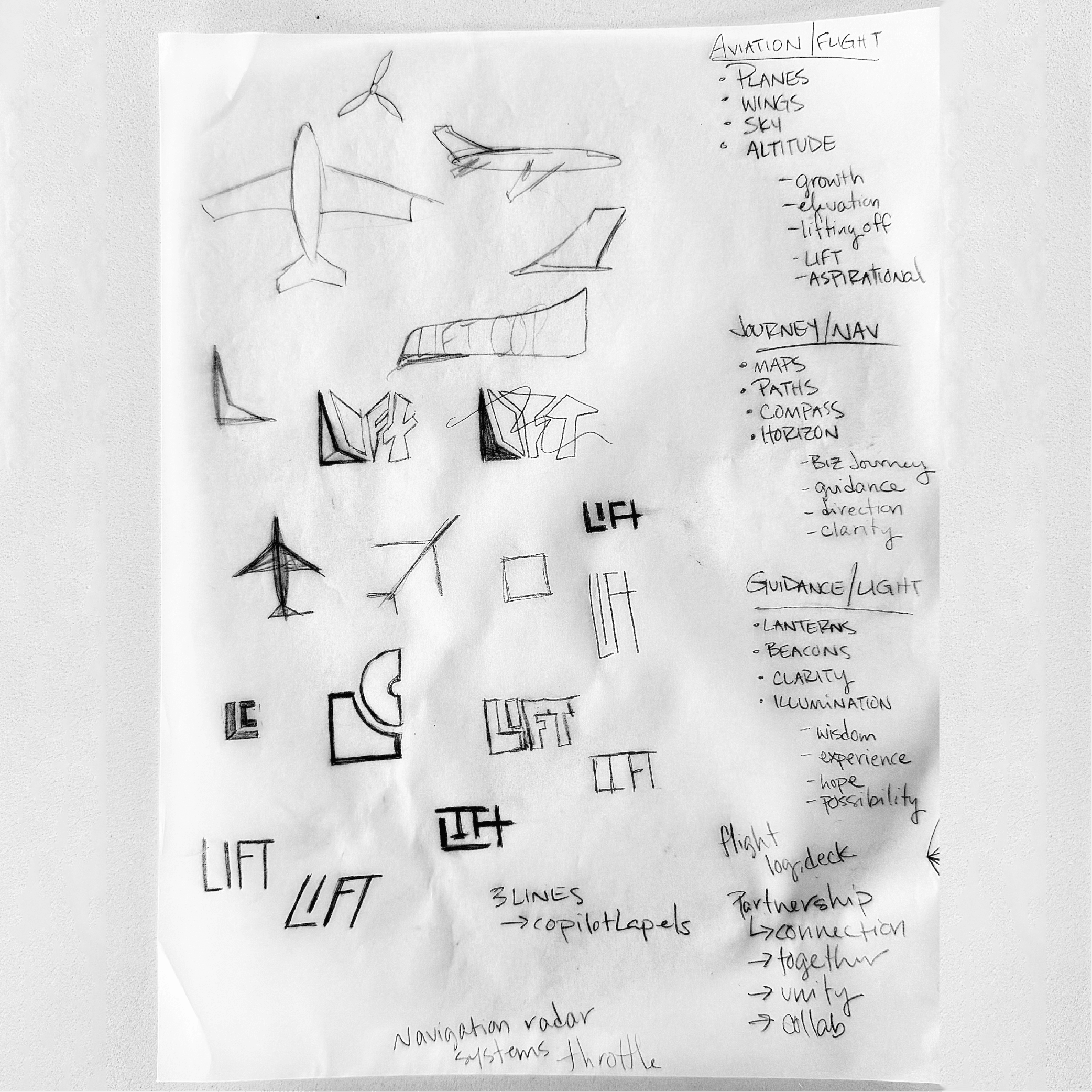
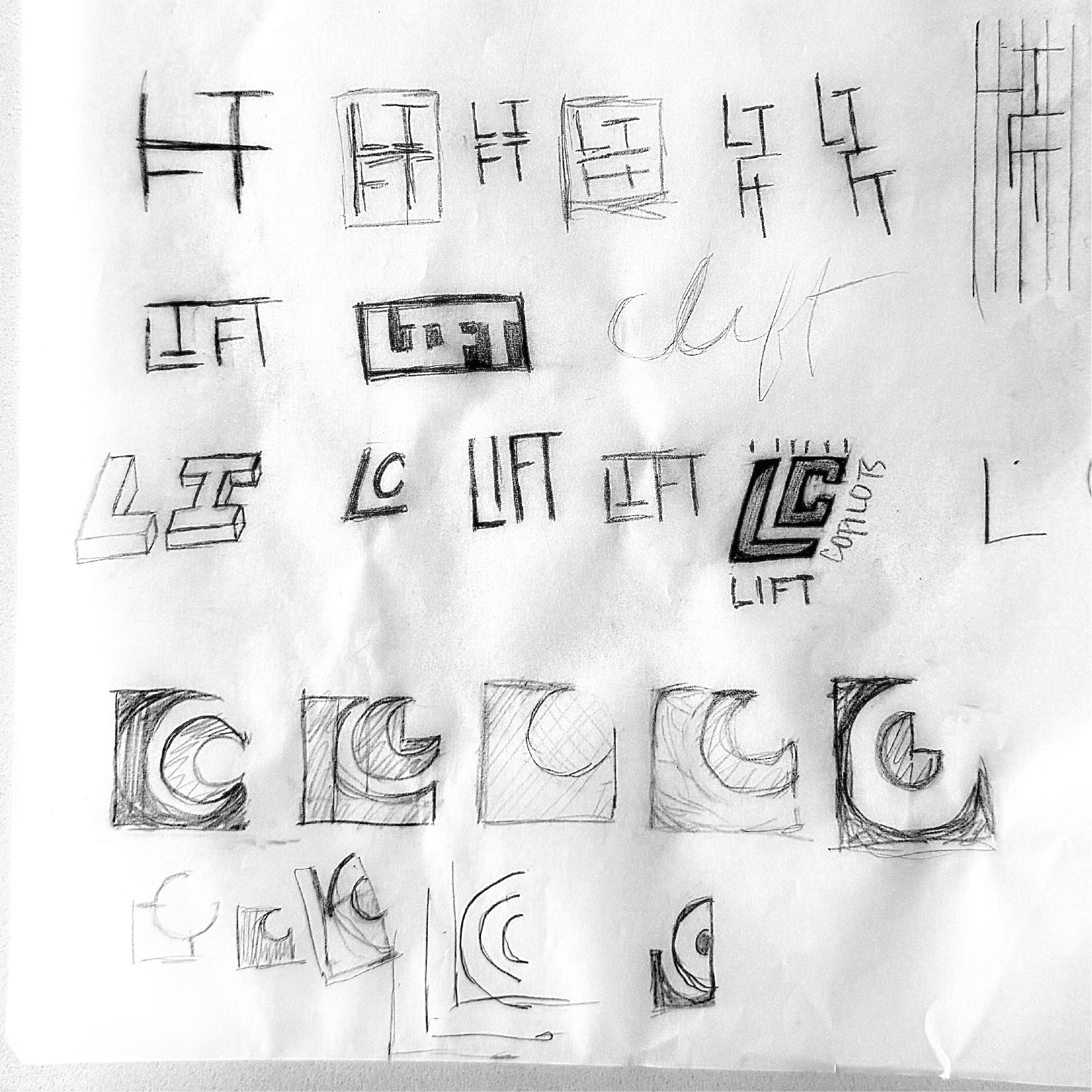
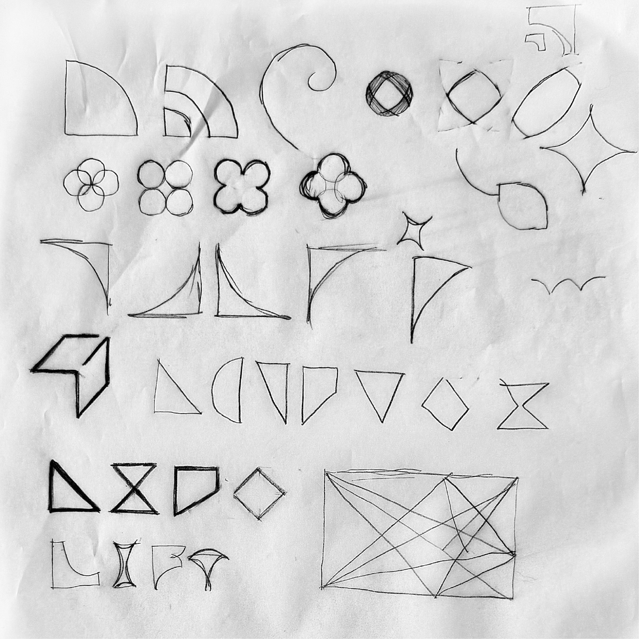
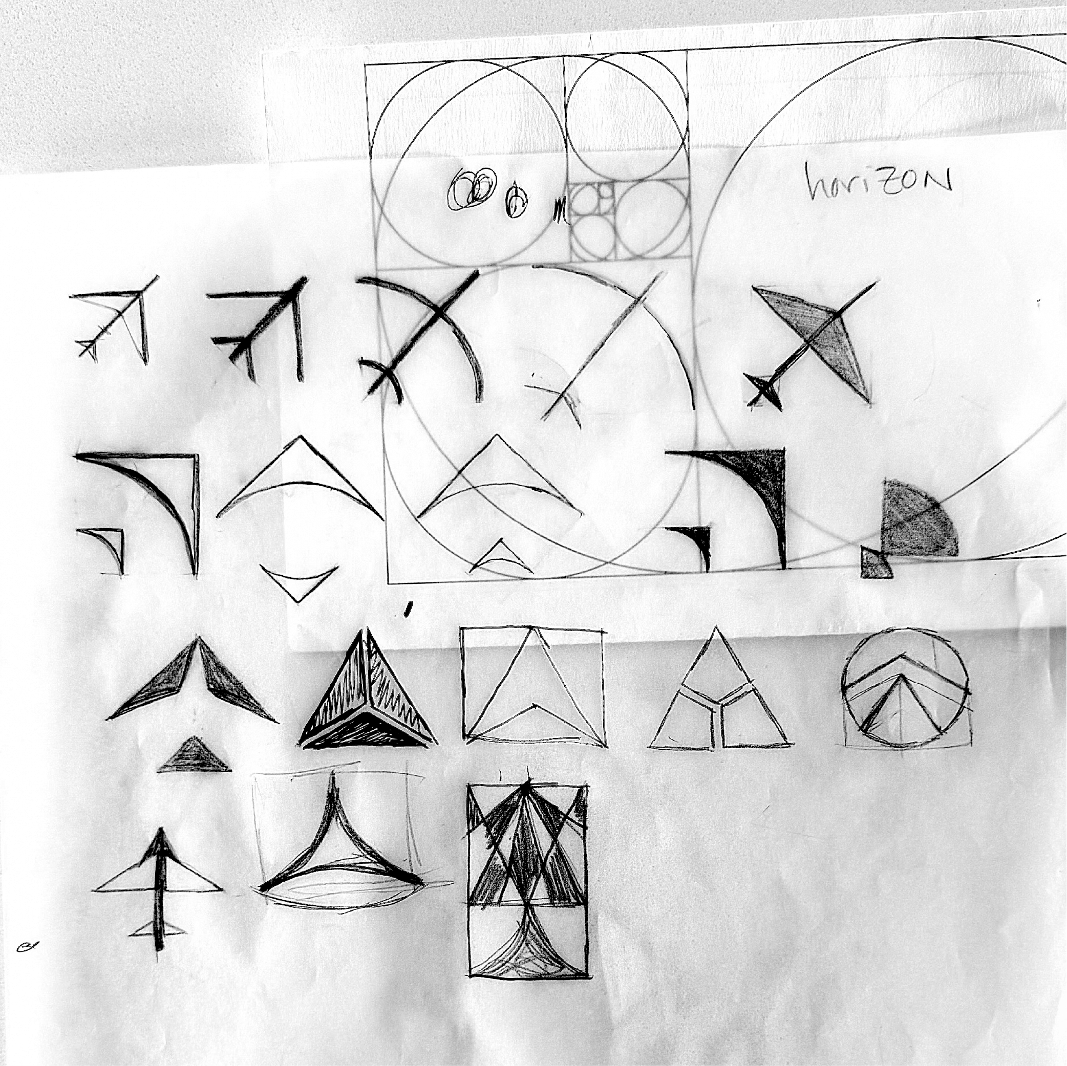
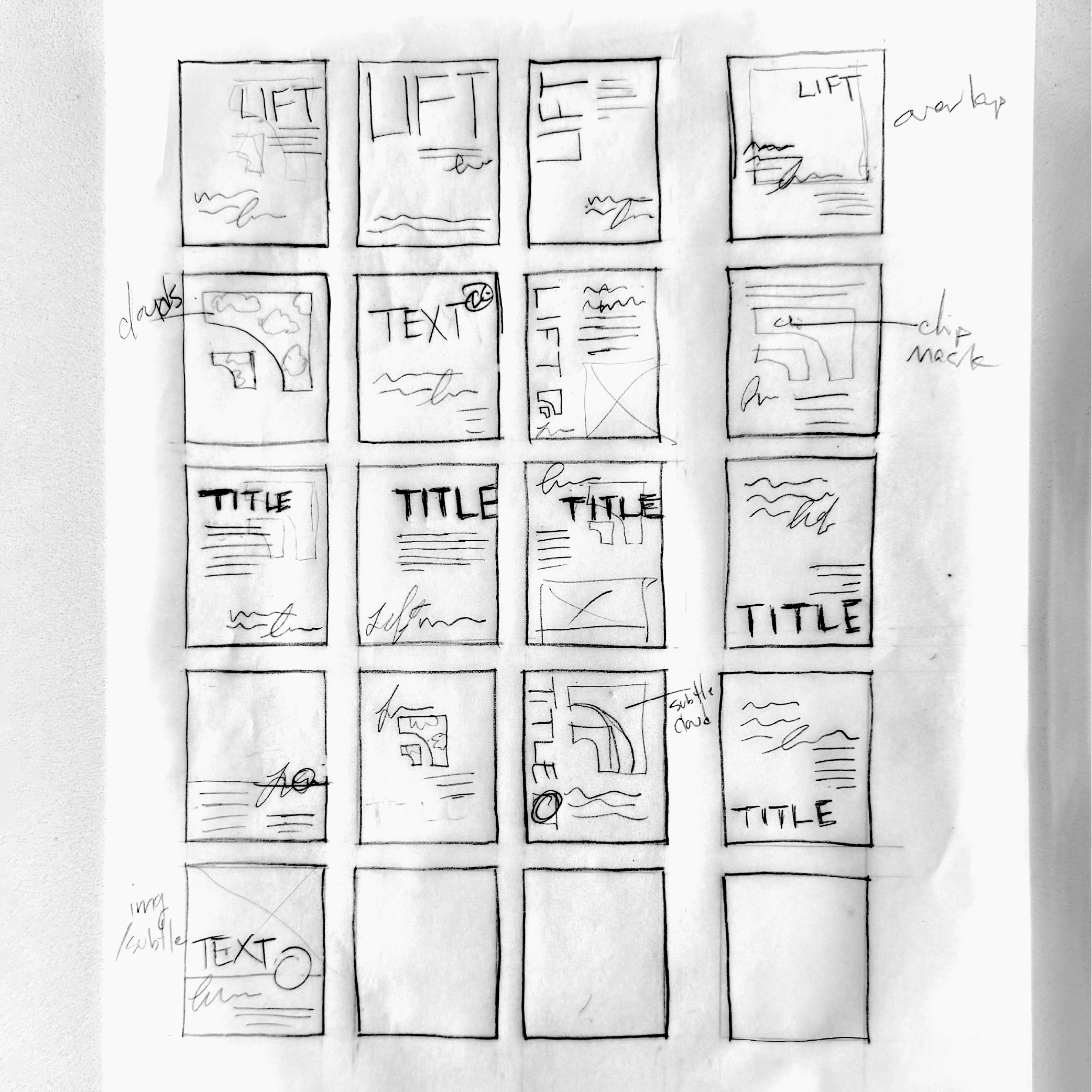
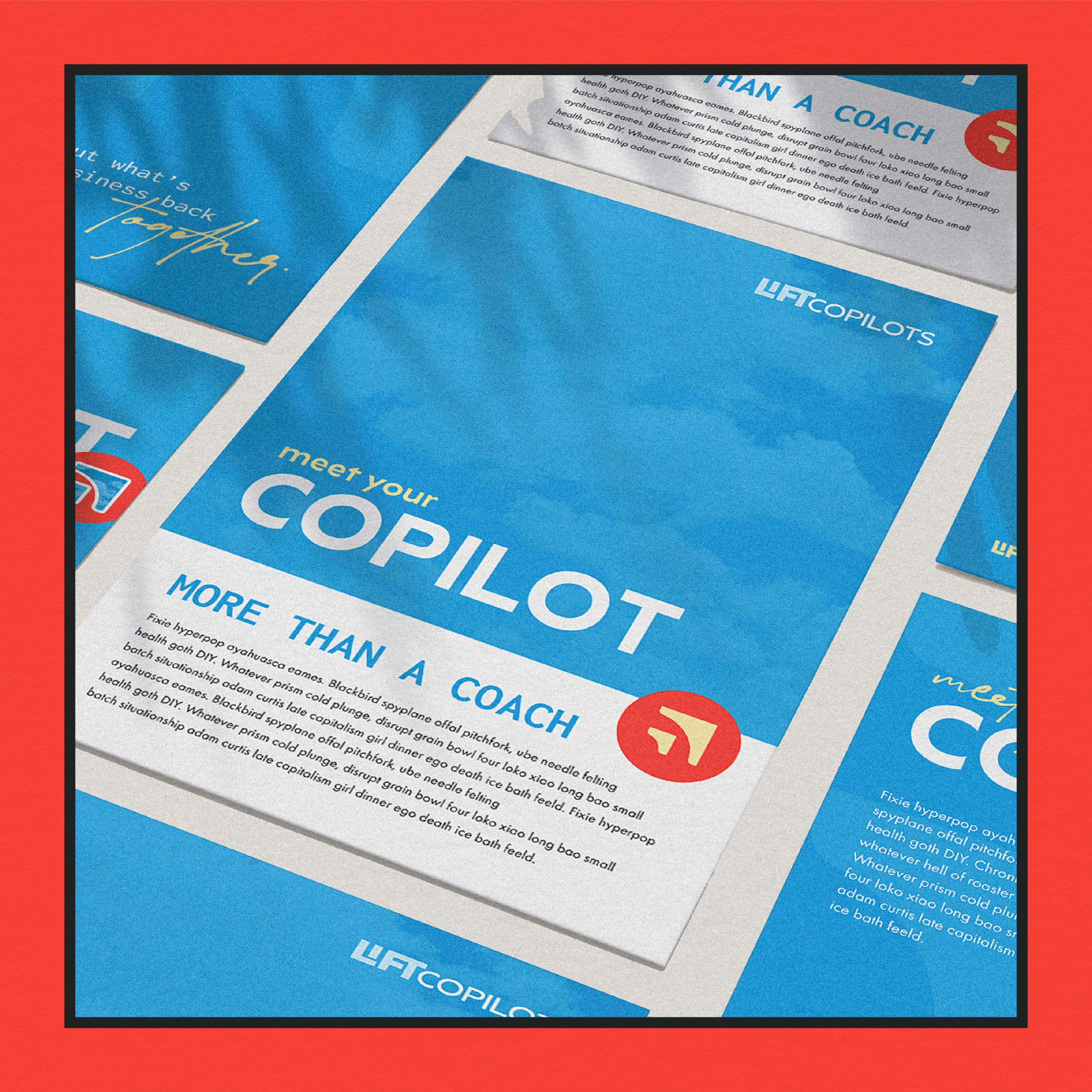
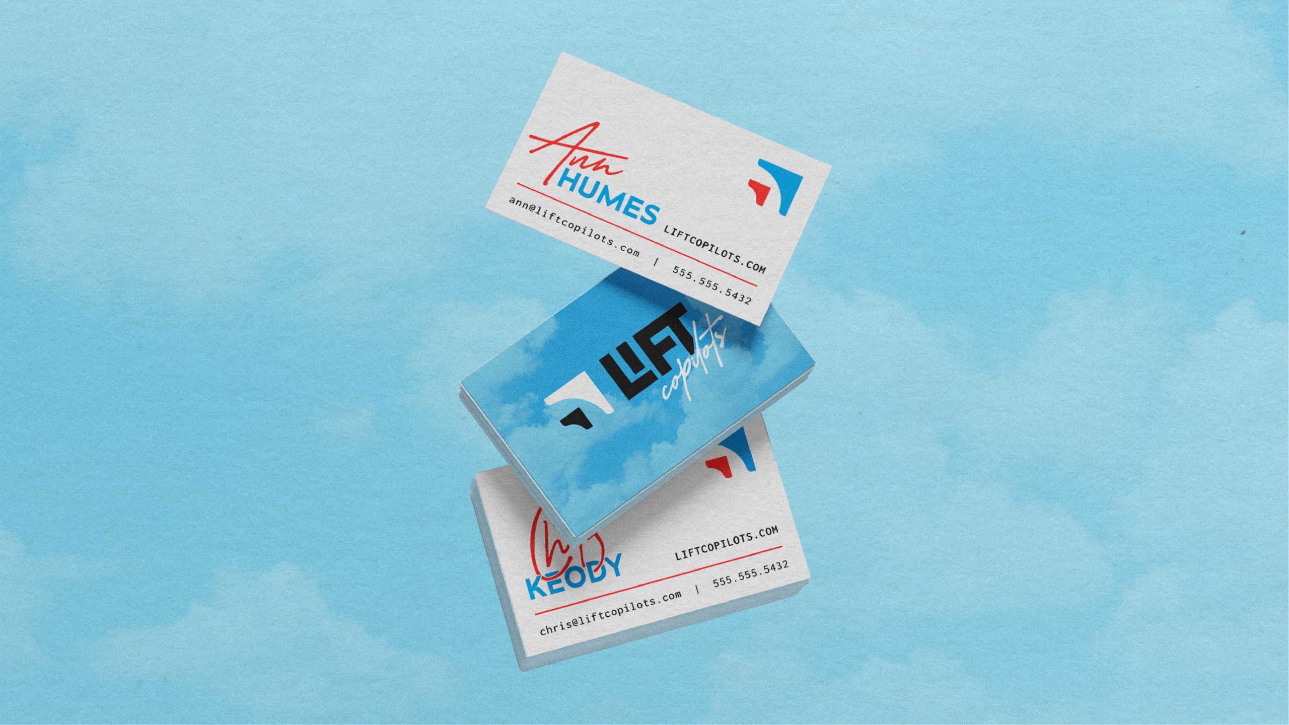
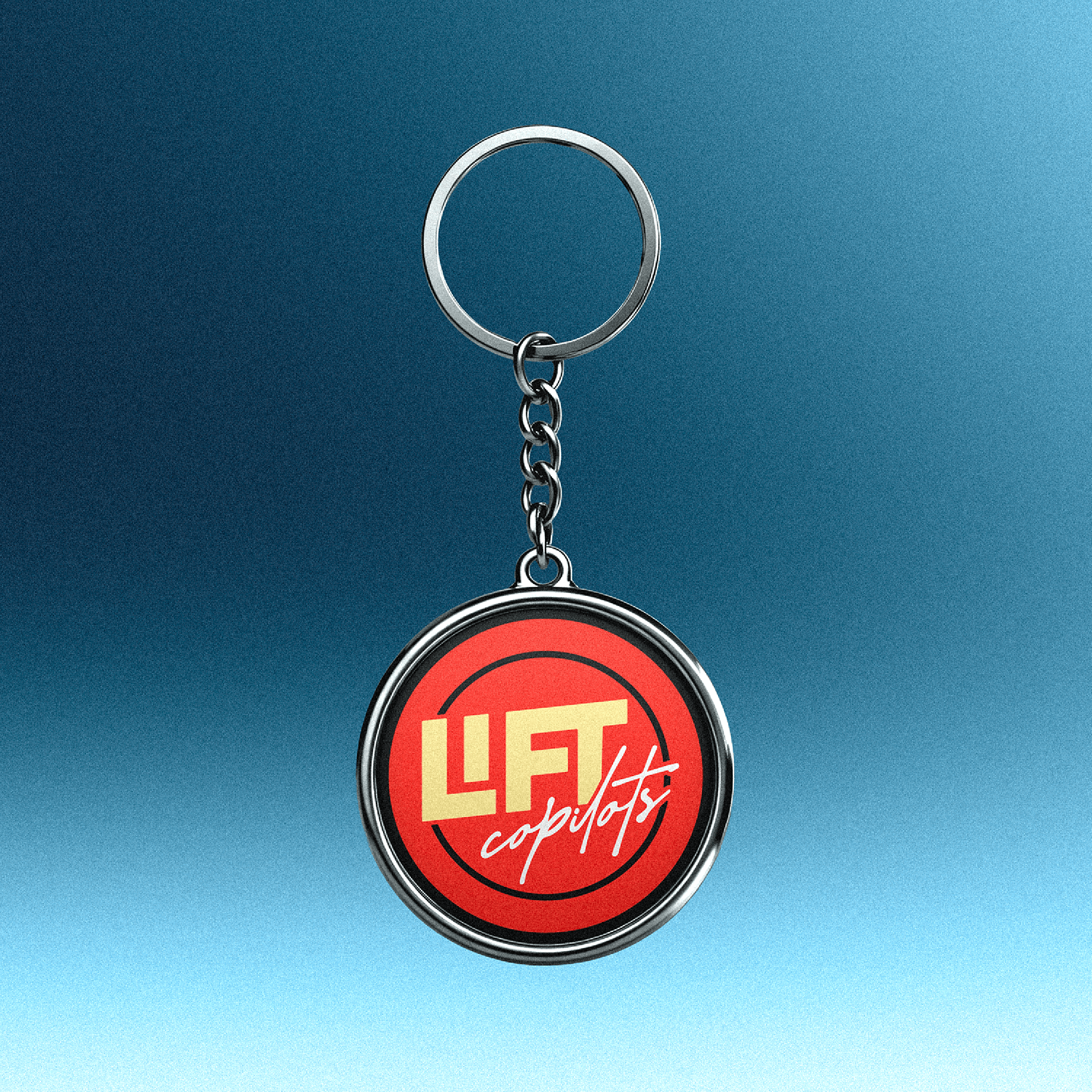
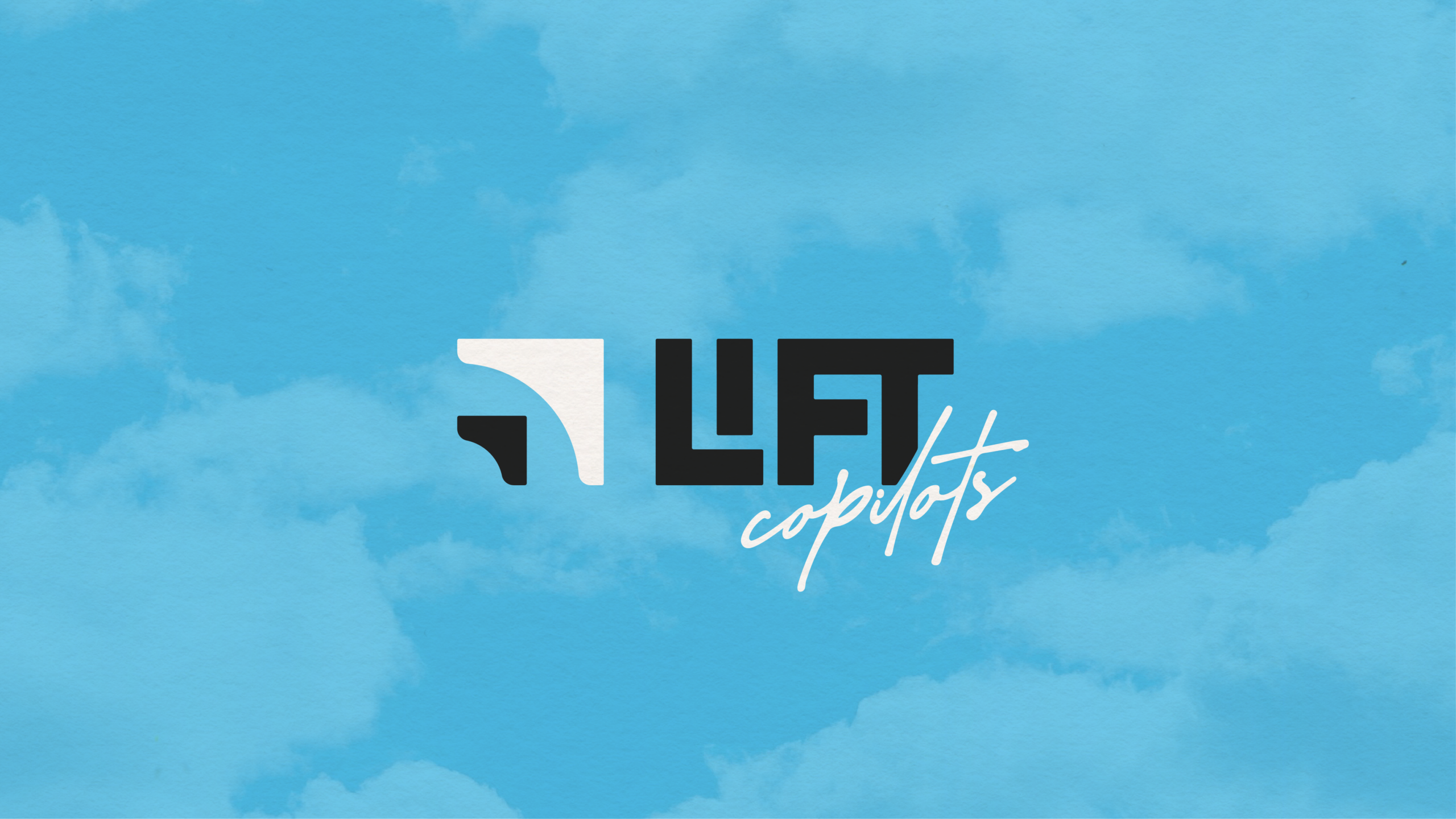
THE DESIGN SOLUTION: The foundation for this concept was formed around the mid-century modern minimalist aesthetic (think PanAm & TWA—the golden age of aviation) with elements from the Bauhaus movement. Because the Bauhaus movement heavily influenced the mid-century modern era I used simple, basic shapes found within the Golden Rectangle used in Bauhaus poster designs to inspire the direction of the icon. From the inital brainstorming I noticed the letters in “LIFT” all form perfect right angles and fit together perfectly so after several variations, this is what we landed on. The hand written script used for “copilots” adds a personable, approachable, human element to this logo design.
AUTHENTICITY
WARMTH
CLARITY